Responsive Design

Multi device adaptive design

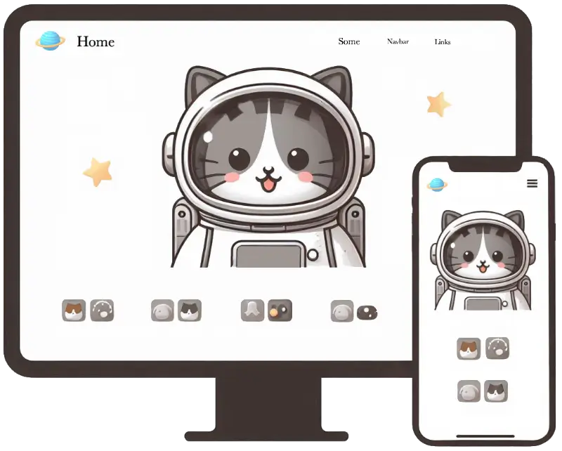
Responsive Design — a method for creating websites that look and function well on any device, from smartphones to wide monitors.

Responsiveness is achieved through the use of flexible layouts, grids, and CSS.

UI Elements adjust their size and position depending on the screen.

Responsive Design Example

As a simple example of responsive design, notice how blocks rearrange when the window size changes:

  • Blocks stack vertically
  • Images resize while maintaining their proportions
Block 1
A cat at the computer responsive image
Block 3

Testing Responsiveness with DevTools

The device toggle in DevTools allows you to test responsiveness and layout adaptation across different device types and screen sizes — from mobile phones to widescreens.

  1. Open DevTools F12
  2. Click the device icon to the left of Elements or use the keyboard shortcut:
    • Windows/Linux — Ctrl + Shift + M
    • macOS — Cmd + Shift + M
  3. Select a device from the list Dimensions or specify a custom resolution using the option "Responsive"
DevTools toggle device toolbar

Checklist for Testing Layout Responsiveness

  1. Device Selection: UI elements display correctly on devices of various types and screen sizes.
  2. Device Rotation: the layout adapts when the device orientation changes (portrait/landscape).
    To rotate the device in DevTools, click the icon with two arrows.
  3. Checking Fonts and Images: fonts and images scale according to screen size.
  4. Checking Navigation Elements: the mobile "hamburger" menu displays and functions correctly.
  5. Checking Interactive Elements: buttons, forms, and other elements work correctly across devices.
Task
Task available to premium users!
Sidebar arrow